Intro
As a designer, I’m deeply interested in environments and mindsets that promote creative ideas. After reading an article by Pagan Kennedy, I wondered how might serendipity play a role in the creative process?
To answer that question, I recruited some friends and we built serendipity.how, an educational and experimental web app for learning how to notice and harness the unexpected.

The site architecture is split into two: the first section is for educating users about the concept and history of serendipity and the second is for practicing a serendipitous mindset.

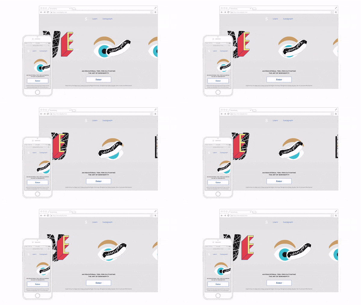
The animated home page is designed to introduce the concept of overlapping objects and ideas.

Magritte and Dalí serve as formal precedents for using juxtaposition in service of evoking ideas and emotions.

Responsive CSS rules adapt content to all screen sizes.

The Juxtagraph is the second part of the site. It is an experimental image-making tool that allows you to practice making unexpected discoveries.

To create a juxtagraph, users scroll through images and tap them to stick them in place. Then they can add a caption and publish to a public gallery of every juxtagraph ever made.

The randomized image queue currently has over one hundred images, chosen based off of any metaphorical interpretations and how aesthetically and emotionally compelling the image is. I also designed a promotional poster for the site launch.

Outcome
Thousands of people have visited the site, learned about serendipity and built juxtagraphs. Personally, I learned how to recruit and lead an interdisciplinary team and how to build and ship a product iteratively.
Role
The design and front-end is by me, while Ze’ev Lailari led the back-end with support from Dan Borstleman and Keenan Zucker. It would not have been possible without generous advice from Penina Acayo, Jonathan Hanahan and all of my studio mates. Thanks for reading, now go make a juxtagraph!
 Work
Work

